News
- Exhibitions
- Font Release
- Interviews
- Juried
- Lectures
- Publications
- Related News
- Reviews
- Workshops
- Writings
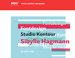
July 20, 2023
Posted In: Lectures
SGD Summer Lecture
Sibylle Hagmann was invited to lecture for SGD (Swiss Graphic Designers), a professional association in Switzerland. The lecture, held in beautiful Solothurn, reflected on the development of Axia, the font family in use by SGD for their very own branding.
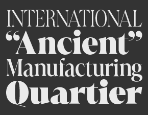
June 9, 2022
Posted In: Font Release
Font Release Marlide Display
Marlide Display is a flamboyant and vibrant typeface classified around the groups of Romain Elzevir and Latins with elegant roundly bracketed serifs and a considerable thick to thin contrast. A type which shines in large letter sizes and that makes text stand out prominently while conveying messages for print and screen alike.
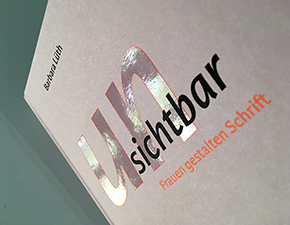
June 6, 2021
Posted In: Publications
Unsichtbar
Barbara Lüth features Odile and Elido in her book Unsichtbar published by August Dreesbach Verlag, Munich. The question of “Where are the women type designers”? is the motivation behind this project. Work of 20 women type designers are included among interviews, and their contributions to the discipline.
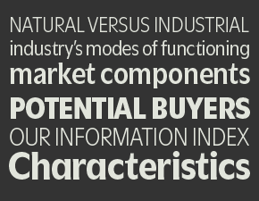
January 10, 2021
Posted In: Font Release
Font Release Utile Narrow
Utile Narrow consists of seven Roman styles and extends the Utile collection with designs narrower than its normal-width counterpart. With a multipurpose aim in mind the type is suitable in applications such as titles, subheads, and data tables, as well as readable passages of text of various length. The two Utile widths, normal and narrow, work effortlessly together and include the same extended Latin character set.
December 20, 2020
Posted In: Publications
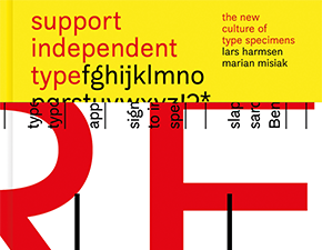
Support Independent Type
Support Independent Type showcases the culture of type specimens produced by unfettered type foundries and designers. The book, created by Marian Misiak, emphasizes the effort that goes into promoting fonts and presents over 400 type labels, including Kontour and Riso-printed specimens for the Kopius and Utile type families.
September 10, 2020
Posted In: Interviews
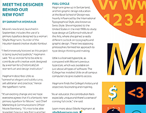
Moore College of Art & Design Magazine
Moore College of Art & Design has a new visual identity with the typeface family Utile, its primary typographic element at its core. An interview conducted by Samantha Weinraub, leading to a short article and published in the Moore Magazine Fall issue, explores Q&As with the designer behind Moore’s new font.
September 15, 2019
Posted In: Reviews
Identifont Recent Additions
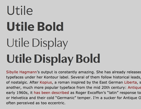
Florian Hardwig reviews recent typeface additions on Identifont’s Blog. In this issue of August 2019, read about his typographic analysis of Niko by Ludwig Übele, Standard by Benoît Bodhuin, and Utile and Utile Display.
June 10, 2019
Posted In: Interviews
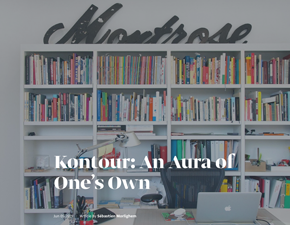
An Aura of One’s Own
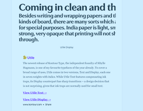
In conversation with Sébastien Morlighem for Fontstand, in an interview titled Kontour: An Aura of One’s Own, Sibylle Hagmann dives deeper into some thoughts on type.
March 29, 2019
Posted In: Related News
Freshfonts features Utile
Titled Ink traps are back in style, Freshfonts features three new typefaces, one of them Utile.
Posted In: Related News
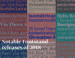
Notable Fontstand Releases
A trio of Fontstand writers, Catherine Dixon, Indra Kupferschmid, and Sébastien Morlighem were asked to take a look at typefaces that were added to Fontstand in 2018, and highlight selected ones for their contribution to type design. Kopius was picked by Sébastien Morlighem from a dozen.