Category Archives for: Reviews
- Exhibitions
- Font Release
- Interviews
- Juried
- Lectures
- Publications
- Related News
- Reviews
- Workshops
- Writings
September 15, 2019
Posted In: Reviews
Identifont Recent Additions
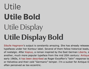
Florian Hardwig reviews recent typeface additions on Identifont’s Blog. In this issue of August 2019, read about his typographic analysis of Niko by Ludwig Übele, Standard by Benoît Bodhuin, and Utile and Utile Display.
February 5, 2017
Posted In: Reviews
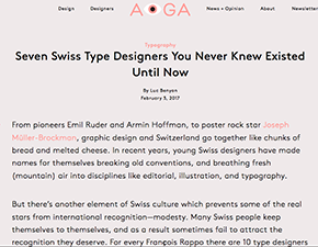
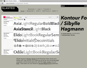
Eye on Seven Swiss Type Designers
AIGA’s Eye on Design Typography feature from February portraits seven Swiss type designers and studios in this post, one of them Kontour. Very happy about the inclusion!
October 16, 2016
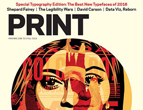
PRINT Magazine Best New Typefaces of 2016
Kopius earned a spot in The Best New Typefaces of 2016 in the PRINT magazine Special Typography Edition together with ten other typefaces. Typographic experts went through three rounds of choosing from a number of typefaces published since January 2016.
March 31, 2016
Posted In: Reviews
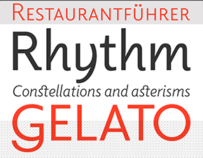
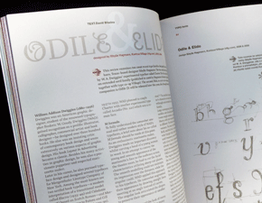
Elido in Use
Elido is currently in use for the Alphabettes blog. Indra Kupferschmid takes a closer look at the typeface, appropriate for very diverse content.
March 15, 2013
Posted In: Reviews
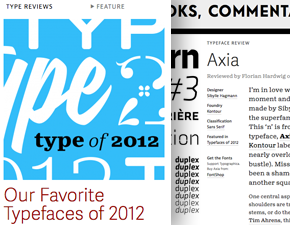
Typographica’s Type of 2012
Florian Hardwig is in love with Axia’s ‘n’! He characterizes the arche’s zenith “refreshingly reckless”. Axia is praised for its “modernist” feel with many foreseeable applications. The accompanying Axia Stencil weights challenge analogue placements of bridges and visually play with gaps that are after all superfluous in digital type. We are simply delighted about Axia’s inclusion in Typographica’s Favorite Typefaces of 2012!
January 1, 2013
Posted In: Reviews
Featured on Slanted Blog
The freshly established Kontour Foundry has been featured on the blog of Slanted. Many thanks to Julia Kahl!
August 1, 2009
Posted In: Reviews
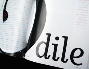
TYPO magazine |summer issue
With his essay titled “Odile & Elido”, David B?ezina writes about William A. Dwiggins and reviews the typeface family Odile and its upcoming Sans companion Elido in the Czech TYPO.36 magazine. Typefaces reviewed in prior issues are: Archer, Arno, Fakir, Greta, Maiola, and Nami.
May 1, 2008
Posted In: Reviews
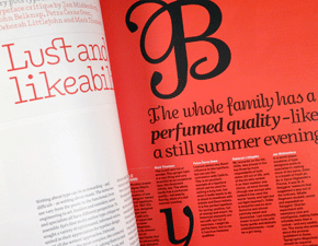
EYE magazine, 67/spring issue
This EYE magazine issue is devoted to type and includes a multi-author type critique titled “Lust and Likeability”. Voices from opinionated and type informed writers were requested. The type family Odile was on the list of fonts to be scrutinized by Mark Thomson, Petra Cerne Oven, Deborah Littlejohn and Jan Middendorp. The font family was received positively, quoting Jan Middendorp: “Odile is a breath of fresh air.”
December 1, 2007
Posted In: Reviews
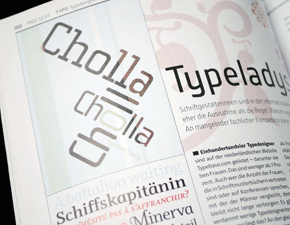
Page magazine
This PAGE issue features an article about women type designers. The article titled “Typeladys” introduces the work of Sibylle Hagmann, Veronika Burian, Verena Gerlach, Magdalena Frankowska, and Trine Rask.
February 1, 2007
Posted In: Publications, Reviews
HOW magazine
This special typography issue of the magazine HOW includes an article titled “The birth of Odile” by Tamye Riggs. This eight-page article highlights and reviews the typeface family Odile, including its source of inspiration, Charter, a typeface design by William Addison Dwiggins.