News
- Exhibitions
- Font Release
- Interviews
- Juried
- Lectures
- Publications
- Related News
- Reviews
- Workshops
- Writings
March 1, 2019
Posted In: Font Release
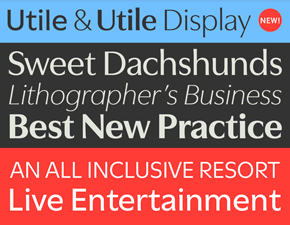
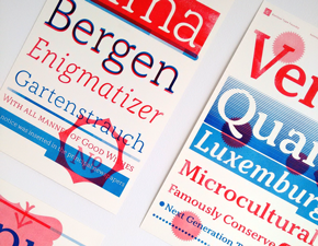
Font Release Utile & Utile Display
With great pleasure Kontour announces the release of Utile & Utile Display. This dynamic duo with 14 styles each offers a balanced range for typographic projects from identity-branding to editorial and advertising for print and screen.
November 16, 2018
Posted In: Related News
Font renting with Fontstand
Excited to announce Kontour font rentals for desktop and web are now available via Fontstand!
May 9, 2018
Posted In: Publications
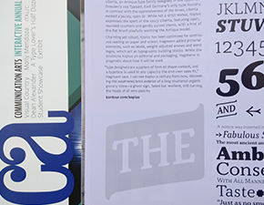
CA Communication Arts
The March/April CA issue includes six fresh typefaces that are spotlighted by Tamye Riggs, a devoted writer, editor and designer, generally typographically obsessed and pivotal to the global type community. Kopius is among five other typefaces introduced as “each with a visual language uniquely its own.”
March 10, 2018
Posted In: Publications
Yearbook of Type III
Yearbook of Type III, published by Slanted showcases some new type on the 2018 horizon, among them Kopius Condensed.
February 26, 2018
Posted In: Related News
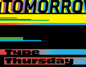
TypeThursday Foundry Spotlight
Ringing in the new year with WIP type crits, Kontour was honored to have been spotlighted for the January and February TypeThursday events in Chicago, London, Los Angeles, New York, Philadelphia, San Francisco, and Seattle. Lucky participants walked away with a Kontour designed Riso-printed Kopius type poster, stickers and a very modest type specimen.
October 18, 2017
Posted In: Lectures
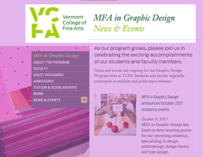
VCFA Residency Guest
Sibylle Hagmann was invited as a guest designer and critic for the Fall 2017 residency at VCFA’s MFA in Graphic Design, together with Dr. Dori Tunstall and Randy Nakamura. An amazing few days filled with exchanging thoughts on design and typography with seasoned design educators and wonderful students.
August 28, 2017
Posted In: Related News
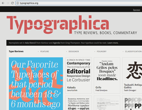
Typographica Nameplate
Visit Typographica and enjoy a nameplate currently set in Axia Stencil in tandem with Agenda from Greg Thompson. Following their tradition, nameplate rotating is one of Typographica’s rituals. So, hurry, check it out before it’s all gone!
July 30, 2017
Posted In: Writings
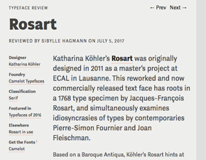
Our Favorite Typefaces of 2016
Typographica delighted in publishing their annual of favorite type of 2016 in July. As per Stephen Coles: Typographic trends have a lifespan that doesn’t correspond to the calendar year, and many popular typefaces remain in style long after they hit the market. This time around Sibylle Hagmann reviewed the beautiful Rosart designed by Katharina Köhler. We hope that her serif family will be a big hit, gaining exposure long after 2017.
June 22, 2017
Posted In: Related News
Kopius Poster Series
Don’t miss out on picking up a limited edition series of four Risograph-printed Kopius type specimen posters, each 11" × 17", lovingly designed by Sibylle Hagmann; numbered and signed on the back. A special thank-you with the purchase of three+ fonts. Lasts until there are no more!
April 4, 2017
Posted In: Font Release
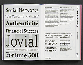
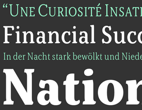
Font Release Kopius Condensed
We are happy and excited to announce the release of Kopius Condensed! Seven new narrow styles with an amiable and alluring flair expand the multitude of the Kopius type family and provide increased typographic range and applications.